")
Online casinos compete in one of the most experience-sensitive digital industries in the world. With real money on the line, users instinctively gravitate toward platforms that feel reliable, transparent, and smooth—even if they can’t explain why. That feeling isn’t accidental. It’s the product of deeply intentional UX design rooted in psychology, behavioral economics, and trust-building patterns.
This article takes a deep dive into the psychology of casino UX: how design choices, color palettes, navigation patterns, and micro-interactions influence trust and engagement. We’ll also explore the difference between ethical UX and dark patterns, and how modern casino operators are creating frictionless onboarding, intuitive payment flows, and clearer bonus communication to increase user satisfaction.
1. Why Trust Matters More in Casinos Than in Other Digital Products
Unlike ecommerce or social media, a casino platform handles something incredibly sensitive: players’ money and emotions. Users need to believe three things instantly:
- The platform is safe.
- The experience is fair.
- Their money and data are protected.
If any of these beliefs crack, users bounce—quickly. This is why UX isn’t simply about good design; it’s about psychological assurance. Trust must be communicated subtly but continuously through consistent visual cues, predictable interactions, transparency, and emotional comfort.
2. Visual Design & Color Psychology: How Aesthetics Influence Perceived Safety
Colors and layout structure are among the first cues users rely on to judge an online casino—even before they navigate.
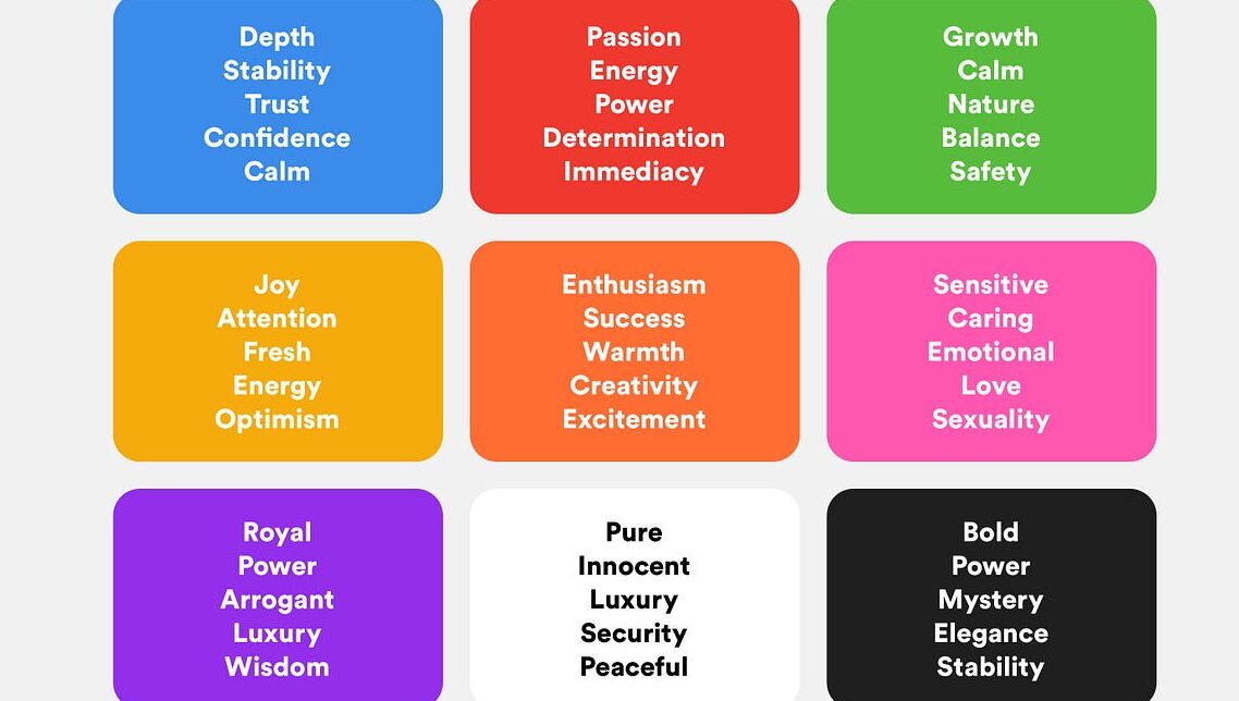
Color Choices and Their Effects
- Blues and greens suggest safety, reliability, and calm. Many regulated casinos lean heavily on these tones because they subconsciously signal legitimacy.
- Gold and red, though energizing and exciting, must be used sparingly. Too much can feel aggressive or “pushy,” evoking high-risk gambling environments.
- Dark backgrounds with neon accents create a modern, high-tech aesthetic but can also introduce ambiguity if not balanced with clarity and readable typography.
Clarity Over Flashiness
Flashy animations and overly stylized graphics may seem exciting, but they can also trigger skepticism. Players often associate overly “gamey” visuals with:
- hidden rules
- confusing payout structures
- a lack of seriousness
Clean layouts with ample negative space communicate professionalism and reduce anxiety—critical when users are about to deposit funds.
3. Navigation Patterns That Reinforce Trust
Trust grows when a platform behaves the way users expect.
Predictability Minimizes Cognitive Load
A trustworthy casino keeps navigation simple and intuitive:
- A fixed bottom menu on mobile
- Clear categories (Slots, Table Games, Live Casino, Promotions)
- Easy access to account settings and wallet
- Consistent iconography
Predictability reduces friction, helping users feel in control—which increases overall satisfaction and retention.
Fast Access to Critical Information
Players shouldn’t need to search for:
- wagering requirements
- deposit/withdrawal limits
- bonus terms
- game rules
Putting these items one or two taps away shows a transparent, player-first approach.
4. Micro-Interactions: Small Details, Big Reassurance
Micro-interactions are subtle animations or feedback loops that convey trust and responsiveness.
Examples in Casino UX
- A subtle wallet balance animation when money is added or deducted creates a sense of accuracy and transparency.
- Button color changes or haptic feedback upon tap confirm that the action was successfully triggered.
- Loading indicators that show progress reduce uncertainty.
These micro-interactions are psychological trust bridges, similar to the mechanics behind why gambling design features keep players coming back.
5. Frictionless Onboarding: The First Trust Test
A long or confusing onboarding process damages perceptions immediately. Modern casino platforms are adopting frictionless onboarding, which includes:
a) Progressive Profiling
Instead of overwhelming new users with a long registration form, progressive profiling gathers information step-by-step:
- email and password
- basic identity information
- full verification (KYC) only when needed
This approach reduces drop-off and maintains compliance without scaring new users away.
b) Clear KYC Process
Transparency during identity verification is crucial:
- Expected time frame
- What documents are required
- Why the documents are needed
Communicating this clearly reduces frustration and reinforces the perception of safety and regulatory legitimacy.
6. Intuitive Payment Flows: Where Trust Is Won or Lost
Payment UX is where players scrutinize the platform most. A trustworthy casino ensures:
a) Minimal Steps for Deposits
Fewer clicks = higher conversions.
A good flow might look like:
- choose payment method
- enter amount
- confirm
Add helpful elements like:
- clearly displayed deposit limits
- expected processing times
- real-time error detection
- recognizable payment provider icons
These cues reduce uncertainty and improve confidence.
b) Transparent Withdrawals
Withdrawals are a major emotional touchpoint. Excessive delays or unclear rules erode trust. Good UX includes:
- visible withdrawal progress (e.g., “Pending → Approved → Sent”)
- estimated payout times
- instant notifications when status changes
Clear communication around withdrawals is one of the strongest indicators of a fair, user-friendly casino.
7. Clear Bonus Labeling & Ethical Incentives

Promotions and bonuses are always a hot button. If players feel misled, they rarely return.
What Clear Bonus UX Looks Like
- Straightforward labels (e.g., “100% up to $300”)
- Hover or tap-to-expand details for key terms
- Highlighting wagering requirements openly
- Progress bars to track bonus completion
Transparency turns bonuses from a suspicious incentive into a rewarding motivation loop.
8. Ethical UX vs. Dark Patterns in Online Casinos
Not all UX is created with good intentions. Casinos, like many digital businesses, can fall into the trap of dark patterns—design tactics that manipulate users into making decisions they wouldn’t otherwise make, as explored in the dark patterns debate in casino design.
Common Dark Patterns in Gambling
- Overly complex bonus rules hidden behind fine print
- Auto-opt-in deposit features
- Misleading button placement, such as “cancel withdrawal” prompts that are too prominent
- Fake urgency, like countdown timers for promotions that reset automatically
These patterns might increase short-term profits, but they destroy long-term trust and brand reputation.
Ethical UX Prioritizes the Player
Ethical design ensures:
- informed decision-making
- transparent gameplay
- controllable costs and clear limits
- responsible gambling tools that are easy to access
- no manipulation of user weaknesses
Ethical UX builds loyalty. And in the age of social reviews and regulatory scrutiny, loyalty is worth far more than trick-based conversions.
9. Why Some Casinos Simply “Feel” More Trustworthy
When all these elements work together—clean design, predictable navigation, honest communication, responsive interactions—the result is a casino platform that feels:
- safe
- transparent
- high quality
- fair
- emotionally comfortable
This feeling isn’t magic. It’s a psychological response to good design.
Players sense when a platform respects them. And in an industry where confidence is everything, that feeling is the ultimate competitive advantage.
Conclusion: UX as the Core of Sustainable Casino Success
Trust is the foundation of the online gambling experience. It’s built through subtle signals—color choices, layout clarity, navigation patterns—and reinforced with transparent bonuses, smooth payments, and ethical design. While dark patterns may generate short-term wins, the future belongs to casinos that prioritize the user’s psychological comfort and long-term satisfaction.
Great casino UX doesn’t just attract players.
It empowers them—safely, confidently, and enjoyably.
Sources:


